


Document your Day
This task challenged me to dedicate a day of my life into studying, and observing a habit or design method that stuck out to me or that I wanted to pursue. As the owner of a graphic design business, I wished to focus on the way that shaping, branding and most importantly colour changed and affected my day to day life.
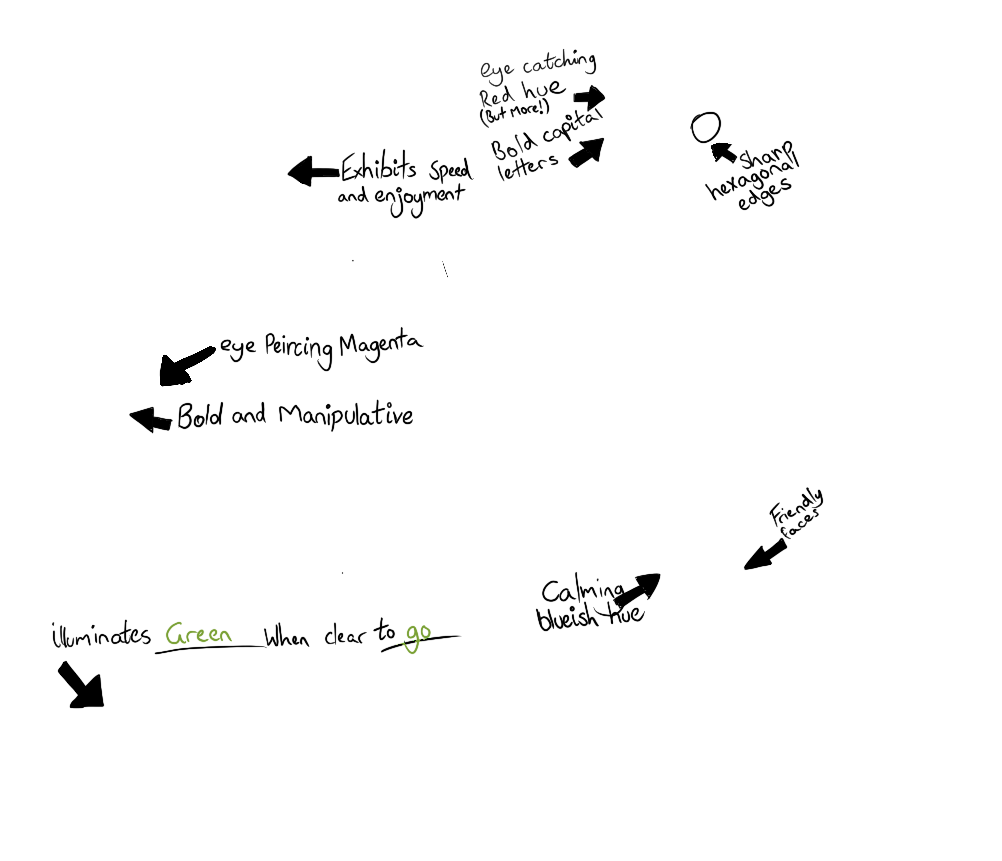
I decided to make scetches from memory of the things that I saw, as I unfortunatley couldn't photograph road signs whilst I was driving. But that gave me an interesting opportunity to exemplify how well, or poorly these designs stuck in my head, hours after. To make it more interesting, I also decided to write this as an essay, in order to make the enjoyment when reading it more fun, and to further my ability to verbally comment on these design concepts.
.png)
.png)
.png)
.png)
I awaken from my slumber, immediately noticing the bottle of water
placed next to my bed ''Natural Spring Water". Clearly the use of such
language was in an effort to make me, the consumer, perceive this
completely unceremonious water, as special. I immediately got changed
and headed for Uni, my brandless Kmart clothes were a solemn reminder
of my dwindling financial status, the only fancy thing on my body being
the "Swiftie" bracelet made for my by a dear friend of mine, a quaint
reminder of the intrinsic love and care present within all (most) human
beings, a bracelet that I continue to wear forever more.
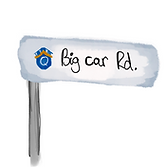
I enter my car and begin to drive down my street,
the gush of wind distracting me from the fairly uninteresting
design of street signs that peppered the roads of my area.
Give way signs, with their bright red hue, strongly advising me to
halt my vehicle. I felt airheaded this day, as if lost in another
realm, a whimsical, almost blissful feeling. However, distraction
soon lead to disaster, as a miss turn lead my down a wild goose
chase, know as "Motorway 1" or the M1 for short. A simple lapse
in judgement left me driving upon this forsaken bitumen. I paid close
attention to the exit signs littering the highway, their
green hue seeming to beg me to follow their path
and see the potential adventures that lie ahead.
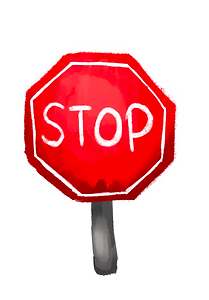
Post turn off, I notice the familiar hexagonal shape, and eye
piercingly red hue of a familiar friend. The stop sign lay ahead,
as if to greet me with open arms. There to shield me from the
agony of a head on collision. The bright red hue caused me to
stop where I stood, as the woosh of cars flew by me, it was as
if they were traveling faster than the speed of sound.
I make it back to Parkwood station, its orange colouring
purposefully chosen as to correlate with, speed, diligence,
precision… and with the gold coast light rail project spanning
from Helensvale to Broadbeach south. I board the tram
that I had ridden so many times, peppered with signs asking
me to pay for my services. The colour choices on these signs
seem… less intentional. The blue colouring if anything caused
me to relax, almost reassuring me that, in fact, I would
not have to pay for my travel. But despite this I paid anyway, why?
The piercing magenta hue of the card reader was impossible
to ignore. I felt my sins crawling on my back, the devilish
pink hue piecing my retinas, and almost as instinct,
I placed my well earned cash upon the card reader.
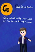
I board the tram to notice a very erratic man shouting profanities
and acting very violently. I was very much afraid, but the polite touch of
blue sprinkled upon the tram helped me feel at ease. Even when the
sharp sound of his phone hitting the floor of the tram shattered my
eardrums, the friendly looking people on the posters, and the colour
choice of yellow and blue, made me feel as though I were lost among the stars.
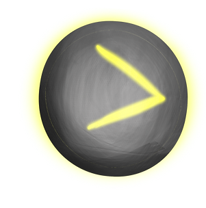
Despite this, I bolted to the doors the moment I head my
stop announced over the loud speaker, the un-illuminated
button giving me pause, as the cries of the clearly meth addicted
man came ever closer to me. I felt my heart sink through my
chest, but almost as if on que, the bright green LED's began to
circle the silver circle. It felt as though the hands of god had
reached out to me and shown me mercy. I spammed the button
and bolted off the tram. Relief washed over me. I could still
hear the man in the background, but now I was faced
with a new enemy. The card reader was back. My soul, burdened
by the fear of this meth addicted man, could not bear to even consider
fighting this malicious magenta madhouse. So I gave in, through
the power of colour theory.
And finally, after a very stressful morning, the exciting and invigorating
red hue of the Griffith university logo welcomed me home. I felt at ease,
as I walked through the lush green atmosphere, knowing I'd now survived
an encounter with a mad man.
This task allowed me to hyper analyze every aspect of design that I was subjected too throughout a particularly stressful day of my life. The elevated level of stress through the day, exemplified the power of design perfectly, and even managed to bring me relief. I discovered and analysed the use and effectiveness of colour in design, and documented it accordingly.


I put the statistics I recorded into a table, in order to visually represent the difference between abundance, and effectiveness. Red is the most abundant colour, being used on stop signs and give way signs, because as such a bold expressive colour, its use is very . which was used very often on road signs that were intended for navigation. Magenta was the least abundant, only appearing on the card readers at the tram station. Similarly orange and blue only appeared as accents around the tram station and on the tram.

Considering the fact that I completely missed the road signs telling me to continue straight, as opposed to turning onto the high way, green was ranked as my least effective. The colour blends into the trees so much, that they're very hard to see unless you're actively looking for them. Red, orange and magenta thrive in this category as they stick out like a sore thumb amoungst the green landscape, on top of being generally more vibrant and eye catching colours. Blue, has the disadvantage of blending in with the green plants that pepper the landscape. However it still is more obvious than the green. The blue also doesn't need to stick out, as its job is to calm not to intice.
Using this graph, it can be determined that effectiveness, and abundance do not nececerally corelate. the documentation of design, colour and all aspects of what makes visual communication so effective, has opened my eyes to the complexity of the design world, and the seemingly minute details that add up to create a massive psycological impact.
References
Griffith University. 2019. “Griffith University.” Griffith.edu.au. 2019. https://www.griffith.edu.au/.